Showing posts with label blue. Show all posts

Wednesday, October 7, 2015

Vintage Cedar Chest in Tiffany Blue

A few posts ago I told you about a couple that was cleaning out a relative's house and had invited me to come over.  I was able to take a tour to see all of their amazing treasures.  When we got up to the attic is was full of things and we did a little poking around.  I happened to see the corner of this cedar chest peeking out of the corner off the back wall.  I said, "What is that?"  They said, "I don't know.  Let's take a look."  He uncovered part of it and it was all I needed to see.  I told him I would take it when he dug it out. :)  Fast forward a few days and I get a message saying she would like to keep the cedar chest, but would like me to redo it for her.  Yea!  I love that. 

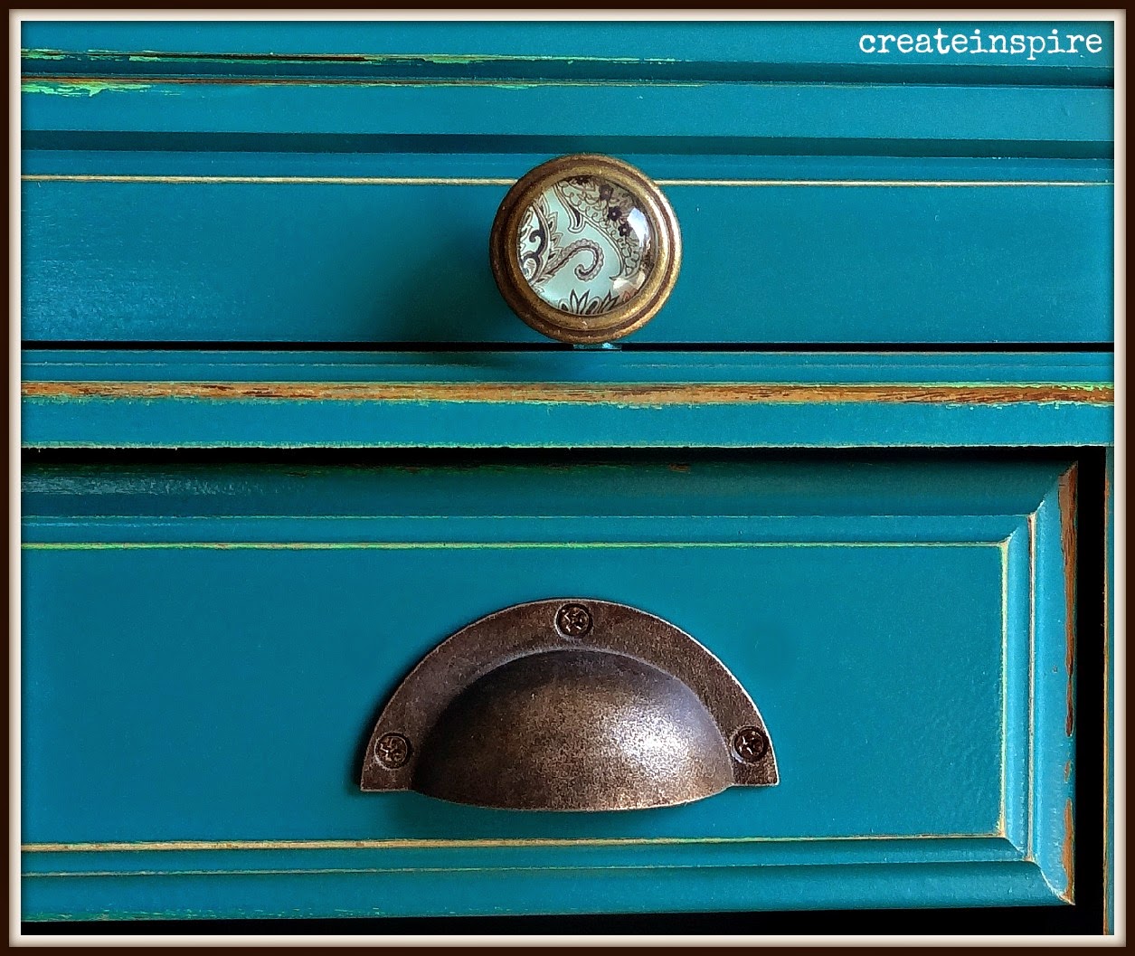
She said she didn't know exactly what she wanted but she did want Tiffany Blue. I don't work with really bright colors a lot, so I was happy to oblige! 

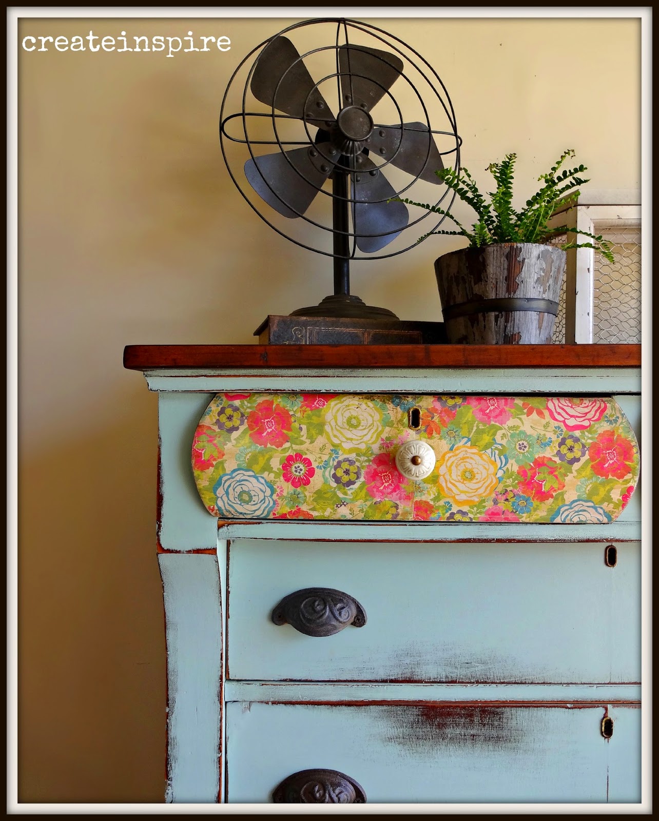
This seriously is the sweetest little chest.  It's very petite and has the prettiest feet on it.  


 BEFORE


 AFTER


 Because this color is very bright and the chest is very small I wanted to leave the top wood to contrast the paint (and to give the eye a place to rest).  It is a beautiful piece of mahogany and refinished nicely.  I love the deep tone of the wood with the paint. 


 I tried gold in the groove and didn't like it, so opted to just sand the edges of it instead.  I like the simplicity of it. 


 See? Cute feet!


The key hole cover was missing so I replaced it with one I had in my stash.  I like the detail it adds. I didn't want to create holes where there weren't any (in case they want to strip this down someday) so I adhered it with Modge Podge.  Love that stuff!


Tuesday, May 5, 2015

Antique Dresser in Seaside from Fusion Mineral Paint

I found this dresser (from a tip from a fellow painter, thank you Whitney!) at our local Habitat for Humanity.  I usually don't shop there as their prices are high (it's for a good cause, I know).  But, this dresser had some kind of hideous reddish brown stain/paint on it so it was a little cheaper. 

It's a good thing I don't ever judge a book by it's cover! :)  It had a cute little shape and great detailing on the mirror. 

When I got it home I realized all the keyhole cover s were missing and the keyholes were ginormously huge!  You'll have to scroll through the pics to see my solution. ;)


 BEFORE


 AFTER

Ah, much better!

The color is Seaside from the Michael Penney line at Fusion Mineral Paint.  The more I work with this paint the more I'm liking it.  It has a great  consistency, but it is a little thinner than other acrylics I've worked with which had me wondering how good the coverage would be.  I'm a two coat kinda gal, but I could have gotten away with one coat in this color.  And, the adhesion is incredible (which is why they suggest you don't wait very long to distress it).  This paint's not going anywhere! :)  


I absolutely adore these knobs and they've been hanging around in my stash for a few months.  I don't do blue very often so I've been waiting for just the right opportunity to use them.  They look so sweet on this petite dresser. 


I wanted that beautiful scroll work to stand out so I painted it a soft white and then gave it a light coat of dark wax (which you totally cannot tell in these pics).


I mentioned the keyhole covers were missing and the holes were very large.  They looked funny and I didn't want to leave them.  But, I also am so impatient I didn't want to order any and have to wait for them to come in the mail.  So, I found these cute covers in the jewelry section at Hobby Lobby.  How perfect are they?! I attached them with old, rusty tack nails I had from another dresser (see it pays to keep junk!).  Loooove them!


I debated on leaving the top natural.  It's a pretty piece of oak and was in good condition, but I think that's why it just wasn't sitting well with me.  It was too nice.  And, the rest of the piece felt just a little more formal than the light top, so dark it went....one coat of Java Gel from General Finishes.


I also found this sweet fabric.  If the drawers have stains I can't sand out I always line them.  

Tuesday, April 28, 2015

Antique Empire in Chappel Green by Farrow & Ball

I found this empire dresser on FB and asked my hubby if he would pick it up on his way home from a job he had out of town.  He was sweet enough to agree and brought it home and put it in the garage.  When I saw the listing on FB it said it was in excellent condition.  Well, let me tell you, my definition of excellent condition is NOT the same as some other people's!  

It needed a lot of work and I actually spent all of yesterday prepping it.  The condition of the piece did help me decide what direction to go with it though.  I'm guessing it's about a 100 years old by the way the drawers were put together and it was definitely showing it's age.  It's structurally sound, but the veneer had some issues.  I always take several things into consideration when deciding to remove veneer and one of them is what do I believe is underneath.  I knew this one was iffy so I decide to patch parts of the veneer and then just leave the rest as it was.  I actually like how little chips look when they are painted and distressed.  Because of the veneer I also decided to heavily distress this one and I love the way it looks!


 BEFORE


 AFTER

I recently did a vintage server in Chappel Green from Farrow & Ball and loved the color, so I knew right away it was going on this dresser.  But, I just love an empire and wanted the top two drawers to be special.  I originally was going to leave them wood because they are gorgeous mahogany veneers.  I just used some hemp oil on them without staining and they were really dark (mahogany is naturally a dark wood).  It made the dresser look top heavy and I didn't like it.  I had picked up this vintage looking floral a few weeks ago and thought it would be perfect for this piece. 


Isn't it precious!  Sigh...


This piece had a lot of "alligator skin" on it and I love how it looks when the paint is rubbed through it.  


 This is the natural top with nothing on it but 3 coats of hemp oil.  It is stunning.


Is there anything I don't love about this pic?  Nope!  The hardware, the paper, the color, the keyhole, and the wood top.  It doesn't get better than this.


This is the fabric that it is going in the drawers (*knock on wood...why does it seem like it takes me twice as long to do anything anymore?)


Would love to know what you think!  She's for sale for $295.00!

Tuesday, April 21, 2015

Vintage Server in Chappel Green

I am just getting over a case of shingles (half of people that get shingles are under 60 and if you've had chickenpox you have a 1 in 3 chance of developing them sometime in your lifetime).  My doctor said they are brought on by stress and low immune system.  I decided to make a change and to quit taking custom work for a while.  I love doing it but it can be very stressful, especially when I have so much of it that nothing else gets done (which is exactly what was happening).  

So, I made the decision (which is huge for me because I have a very hard time saying no) and by golly I was going to stick to my guns...

UNTIL...

Little Ms Michele shows up in my driveway with the cutest little beastie hanging out of the trunk of her car.  How in the world could I say no to that?!!  I just love her to pieces, too, so we talked over what she wanted and I totally and completely caved....again.

But, it's a good thing because I am so thrilled with how it turned out and so is she, so it was a
 WIN WIN! :)


 BEFORE (kind of)


I had already started sanding the top down.  You can't see in this pic but it has 3 big cracks on the left side of the top.  She liked how rustic the rest of it looked and I told her then why not just accept it for what it is and we'll just roll with it. :)  

It's all oak and it was pretty dry so the grain was even more open than oak usually is. I knew it would be perfect for a very "used"  look. 


 AFTER

I've been dying to use a new color I got from Farrow & Ball.  It's Chappel Green and it's a lovely shade of blue/green.  

It seriously is the sweetest little thing!


She is using it in her bathroom and has another barnboard cabinet, so we decided a dark stained top was too formal.  She loved how the wood looked worn out.  It does have so much character!  So, I sanded it down, but not too perfectly and then just gave it three coats of Varathane in satin.  It compliments the shape of the piece, the color, and the distressing so well!


This pic is pretty accurate for the color.  I distressed it a bit heavier, in keeping with the feel of the piece.  We were going to keep the original knobs, but when my hubby was trying to fix the one in broke completely in two so I substituted these cute things.  I like how they mimicked wood.


It'll be time to plant flowers soon here!  Can't wait!


You'll be seeing this color again soon!
:)

Friday, March 20, 2015

Roll Top in Renfrew Blue (Fusion Mineral Paint)

Thank goodness for classifieds on FB!  I've been sick for the last month (and, it's progressively gotten worse instead of better) so haven't been in the mood to do any kind of furniture picking BUT my local classifieds page on FB makes it pretty easy, and for that I'm so grateful!  

I saw this cute roll top and couldn't pass it up.  Seriously, it is the sweetest little thing!  It's got the cutest little cubbies and legs. 

This is the worst I've had spring fever...EVER.  So, I decided in lieu of impending warmer weather, flip flops, and sunshine I was going to do something fun with it!  

Fusion Mineral Paint recently got a hold of me and asked if I would like to try their products  (be sure to check out their gorgeous website!).   Really?  Do you think it is even possible for me to turn down new paint?  And, free paint at that?!  No way hose, so I picked out a few colors and waited for my box to come in the mail.  It came and it was BULGING.  I'm dead serious.  The top had to be taped down to keep it from popping open!  I couldn't believe how many awesome colors they sent me to try out!  I was doing my happy dance in the living room. ;)  

I chose Renfrew Blue and Ceramic for this cutie and decided to layer them because the springy green scared me a bit. It's actually a beautiful vintage green, but beautiful vintage green is out of my comfort zone, so I took baby steps. 


BEFORE

I have resigned myself to the fact that I will never have a magazine worthy garage, so you will just have to deal with looking at the crap like I do. :)  But, do you see what I mean?  Isn't she just adorable??


 AFTER

The color is not quite this bright and I am in love with it.  It's rich and vibrant and perfect for a pop of color.  

I also loved working with the paint.  It's an acrylic so it doesn't dry as fast as a chalk or milk paint but that allows it to level out so nicely and it has a nice, smooth consistency.  It has a pretty satin finish and does not need a topcoat if not distressed.  So, you can save yourself a step!


 This pic is truer to the color than the others. 


Wednesday, October 22, 2014

Antique Lowboy w/ Mirror

 
While I was trying to figure out what I was going to do this winter (because I totally didn't want to work in my garage with a propane heater again) I had decided I was done taking furniture.  But, you know how that goes. As soon as I decide that then someone tags me on FB and I am faced with a moral dilemma.  Ok, so maybe it's not a moral dilemma.... but a dilemma nonetheless. It sure is hard to say no to some things!  I told myself just one more piece wouldn't hurt, and as soon as I justified purchasing this sweet little lowboy I was in hubby's truck, son in tow, to go pick it up.
 
I'm glad I didn't say no. ;)
 
Btw, did I mention that I have THE BEST HUBBY in the world?!  I know I've said it before but I'm going to say it again because it's so true!  He said he had to go run an errand the other day and came back with a pellet stove for the garage!  So, now I don't have to paint in stinky propane fumes and have a cozy fire to work by to boot!  How lucky am I?  I truly don't deserve that man.
 
 
 Before
 
Isn't she so sweet?  I love the curvy top drawers.
 
I just finished two red dressers so it was time to go a little softer again.  I'm STILL in love with soft turquoises and I have a ton of left over paint, so I decided to mix my own again.  I can't get enough of a grayed out turquoise that's a little on the green side (which for some reason never shows very well in pics, so you'll have to trust me).


 After


There isn't anything I don't love about this one.  The color, the hardware, the distressing, the wood top, the keyhole, the details...

This one was tiger oak but the veneers were in pretty rough shape, cracked and peeling.  I had to remove the veneer from the top and fortunately there was nice wood for the sub.  I sanded it smooth, stained it with Java Gel for good coverage, and then sealed it with Minwax Polycrylic.  Now that my gallon is gone I will probably switch back to Varathane or General Finishes top coat. 


 These antiqued pewter knobs are still one of my faves and I love them with this washed out color.


This piece has just the right amount of detailing and I wanted to highlight it.
 
It's funny because when I first started painting I didn't really think I had a "style".  Now, as I look at my pics I can definitely see my style and I'm glad it's morphed into something of my very own. 
I've never wanted someone to be able to say of me that I've copied their work and I can see how my work is MY work.  I don't know if that makes sense to you, but it does in my head so we'll just go with it. :)


 Detail on the top of the mirror.


 I still love these cup pulls too.  I never get tired of a cup pull!