Tuesday, May 5, 2015

Antique Dresser in Seaside from Fusion Mineral Paint

I found this dresser (from a tip from a fellow painter, thank you Whitney!) at our local Habitat for Humanity.  I usually don't shop there as their prices are high (it's for a good cause, I know).  But, this dresser had some kind of hideous reddish brown stain/paint on it so it was a little cheaper. 

It's a good thing I don't ever judge a book by it's cover! :)  It had a cute little shape and great detailing on the mirror. 

When I got it home I realized all the keyhole cover s were missing and the keyholes were ginormously huge!  You'll have to scroll through the pics to see my solution. ;)


 BEFORE


 AFTER

Ah, much better!

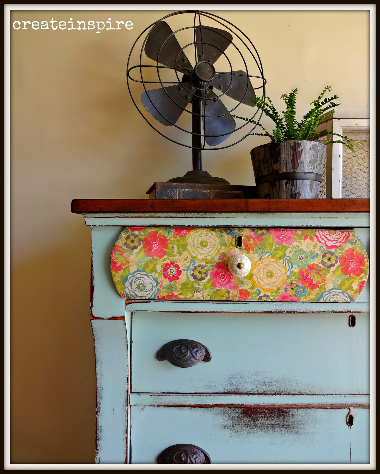
The color is Seaside from the Michael Penney line at Fusion Mineral Paint.  The more I work with this paint the more I'm liking it.  It has a great  consistency, but it is a little thinner than other acrylics I've worked with which had me wondering how good the coverage would be.  I'm a two coat kinda gal, but I could have gotten away with one coat in this color.  And, the adhesion is incredible (which is why they suggest you don't wait very long to distress it).  This paint's not going anywhere! :)  


I absolutely adore these knobs and they've been hanging around in my stash for a few months.  I don't do blue very often so I've been waiting for just the right opportunity to use them.  They look so sweet on this petite dresser. 


I wanted that beautiful scroll work to stand out so I painted it a soft white and then gave it a light coat of dark wax (which you totally cannot tell in these pics).


I mentioned the keyhole covers were missing and the holes were very large.  They looked funny and I didn't want to leave them.  But, I also am so impatient I didn't want to order any and have to wait for them to come in the mail.  So, I found these cute covers in the jewelry section at Hobby Lobby.  How perfect are they?! I attached them with old, rusty tack nails I had from another dresser (see it pays to keep junk!).  Loooove them!


I debated on leaving the top natural.  It's a pretty piece of oak and was in good condition, but I think that's why it just wasn't sitting well with me.  It was too nice.  And, the rest of the piece felt just a little more formal than the light top, so dark it went....one coat of Java Gel from General Finishes.


I also found this sweet fabric.  If the drawers have stains I can't sand out I always line them.  

Friday, May 1, 2015

Antique Headboard to Bench in Antique White

I bought this headboard and foot board at an auction last summer.  I'm not usually one to let projects sit around, but I wasn't sure if I wanted to leave it as a headboard or convert it into a bench.  BUT, converting into a bench required the skill of my handy hubby and he's busy...all the time. ;)

So, there it sat.  I was in our storage unit a few weeks ago and was reminded of it again and thought it was time to get this particular project done.  Craig agreed to work his magic and started putting it together for me.  It was a little trickier because I wanted to use the foot board for the sides, but the foot board was curved on the ends (which makes it awesome, but tricky).  It's a good thing he knows what he's doing though and he made it all work.

On the last bench we did together I had people asking me for instructions on how to do it.  Please don't ask.  I have no clue.  He made supports all the way around for the seat to sit on and screwed it all together.  That's about all I can tell you. ;)


 BEFORE (kind of)


 AFTER

I love that it's simple, but the curved fronts make it so special.  I chose Antique White from General Finishes because it's rather tall and I was afraid going dark with it would make it look like a beast.  The original finish on it was amazing, lots of bumps and alligator skin, so I chose to do the white, heavily distress it, and then dark wax it to bring out all that texture. 

I also have to tell you the bleed through was absolutely terrible.  I had to do about 5 coats of shellac.  Ugh!


I found the fabric at JoAnn's and just love it.  


It's not perfect but it's amazing! 


Wednesday, April 29, 2015

Oak Jewelry Stand

I really do have a problem.  I was driving my daughter to school on Friday and saw this on the way (we only live a couple of blocks from the school).  I sped up a little and Ania asked me what I was doing.  I told her I had to hurry so I could get back there and grab it before someone else got to it.  She gave me the look (I thought I was the one that was supposed to give "the look") and I said, "What?"

I knew right away what I wanted to do with it and it turned out even cuter than I thought it would (and I kept telling asking hubby if he thought it was cute and he gave me "the look", too!  Humph!).


 BEFORE

I love the shape of it, but the oak had to go.  Sorry, oak lovers. The little drawer fronts were perfect for my idea and some of the original trim was missing anyway, so I just took the rest of it off the drawers.


 AFTER

So much better!


I've been getting a lot of questions about how I do my decoupage and how it turns out so smooth.  I really don't have a secret.  I use scrapbook paper so it's a little heavier and I think that helps.  I also do a thin layer of MP because if your paper gets too wet then there's a better chance of it wrinkling.  I lay the paper on and smooth it out.  You can use a credit card or flat surface, but lately I've just been using my hand.  Be gentle, or you can tear the paper.  I wait for it to dry all the way before I do the top coat of MP.  It usually turns out pretty nice.


These knobs with this paper remind me a little of French Country and I just love it. 


Tuesday, April 28, 2015

Antique Empire in Chappel Green by Farrow & Ball

I found this empire dresser on FB and asked my hubby if he would pick it up on his way home from a job he had out of town.  He was sweet enough to agree and brought it home and put it in the garage.  When I saw the listing on FB it said it was in excellent condition.  Well, let me tell you, my definition of excellent condition is NOT the same as some other people's!  

It needed a lot of work and I actually spent all of yesterday prepping it.  The condition of the piece did help me decide what direction to go with it though.  I'm guessing it's about a 100 years old by the way the drawers were put together and it was definitely showing it's age.  It's structurally sound, but the veneer had some issues.  I always take several things into consideration when deciding to remove veneer and one of them is what do I believe is underneath.  I knew this one was iffy so I decide to patch parts of the veneer and then just leave the rest as it was.  I actually like how little chips look when they are painted and distressed.  Because of the veneer I also decided to heavily distress this one and I love the way it looks!


 BEFORE


 AFTER

I recently did a vintage server in Chappel Green from Farrow & Ball and loved the color, so I knew right away it was going on this dresser.  But, I just love an empire and wanted the top two drawers to be special.  I originally was going to leave them wood because they are gorgeous mahogany veneers.  I just used some hemp oil on them without staining and they were really dark (mahogany is naturally a dark wood).  It made the dresser look top heavy and I didn't like it.  I had picked up this vintage looking floral a few weeks ago and thought it would be perfect for this piece. 


Isn't it precious!  Sigh...


This piece had a lot of "alligator skin" on it and I love how it looks when the paint is rubbed through it.  


 This is the natural top with nothing on it but 3 coats of hemp oil.  It is stunning.


Is there anything I don't love about this pic?  Nope!  The hardware, the paper, the color, the keyhole, and the wood top.  It doesn't get better than this.


This is the fabric that it is going in the drawers (*knock on wood...why does it seem like it takes me twice as long to do anything anymore?)


Would love to know what you think!  She's for sale for $295.00!

Friday, April 24, 2015

FP Drexel in Coral Bells from Sweet Pickins

A sweet friend emailed me about this Craigslist listing.  I was so excited when I saw the price and then realized the price was for TWO Drexel dressers, not just this one.  I couldn't get to my phone quick enough!  It's a good thing, too, because by the time I drove 45 minutes he had already received 15 other calls on it!  Thank you so much, Sandy!!

When I saw what beautiful condition they were in my heart started pumping. Lol,  It's fun when any day can be like Christmas! ;) 

I knew right away what I wanted to do with this one.  I don't do really girly very often and I rarely do any shade of pink, but Sausha from Sweet Pickins recently came out with a new color in her milk paint line. It's called Coral Bells and it was just speaking to me from her page. :)  Love, love, love it. 

I ordered the paint and couldn't wait for it to get here.  A few days later it came and I was still finishing up some other custom work and was chomping at the bit to get started on this cutie. Half way through I realized I wasn't going to have enough paint to do the entire dresser. so I had to put my thinking cap on because I couldn't wait to order more paint.  

I decided I would do just the drawer fronts with the milk paint and do the body in my regular ProClassic and just have it color matched.  When it all dried and I finished up the drawer fronts I put them in the dresser and they looked good except the ProClassic had dried just a tad bit more orange than the Coral Bells.  You couldn't tell on the thin pieces, but the bottom was very obvious.  AND, the drawers chipped beautifully (which is what I was hoping for), but the latex on the skirt (which is right next to the bottom drawers) was smooth as butter.  It just didn't look right. I tried chipping it with the putty knife, but it didn't look as natural as the drawers and I couldn't live with it.  So, I sat on my garage floor until I had an epiphany and I remember I had this cute paper from a project two years ago.  Perfect!

So, it was a happy accident and I couldn't love it more!


BEFORE

Seriously, who doesn't love a great French Provincial piece?!  That's a rhetorical question as I'm sure there's someone out there who hates them, but it's just lovely. 

I did shellac the entire dresser (other than the top which was being sanded down and stained) because it's cherry and I knew the bleed through would be terrible.  I let the shellac dry overnight before painting so the milk paint would still chip.


 AFTER

I know the staging is minimal for me, but I was losing light and I didn't want to wait until tomorrow to post it. Lol

I love the contrast of the dark wood top, the bright white insets of the drawers, and the dark hardware all with the vintage paper and this to-die-for color. Yum!


I painted the white first then was super careful taping off so I would have nice crisp lines.  They look amazing. I also used Maison Blanche's Le Dirt Antiquing Dust on the inside of the lip.  I wiped most of it back but I like how it left it in the corners and gave it just a little definition between the lip and the inset.

Milk paint is so unique in how it chips and it just looks very natural.  I really like that.  I also love the patina of the original hardware and just left it (which I almost never do!).


 I did use General Finishes top coat in Flat over the entire piece. 


 The top was refinished by sanding it down to the bare wood with 150 grit, then stained with GF Java Gel, and finished with their topcoat in flat. 


 This skirt is just the icing on the cake for me.  It's scrapbook paper and I used Modge Podge to adhere it. *tip:  Cut your paper so it's close, but not exact, adhere it, and when it's dried for a few minutes run a piece of sandpaper along the edge until it falls off.  Voila!  Perfect fit every time.


So cute!
Have a great weekend!

Wednesday, April 22, 2015

A Little Bit of Sunshine


I like the idea of yellow.  But, I don't like yellow.  

I always think I want to paint a piece yellow, but never do, because when it comes right down to it yellow is hard.  I don't like it too bright and I don't like it too....well, yellow.  I know, it makes no sense. That is why it's crazy that when I saw this little empire dresser I knew it needed to be yellow!  

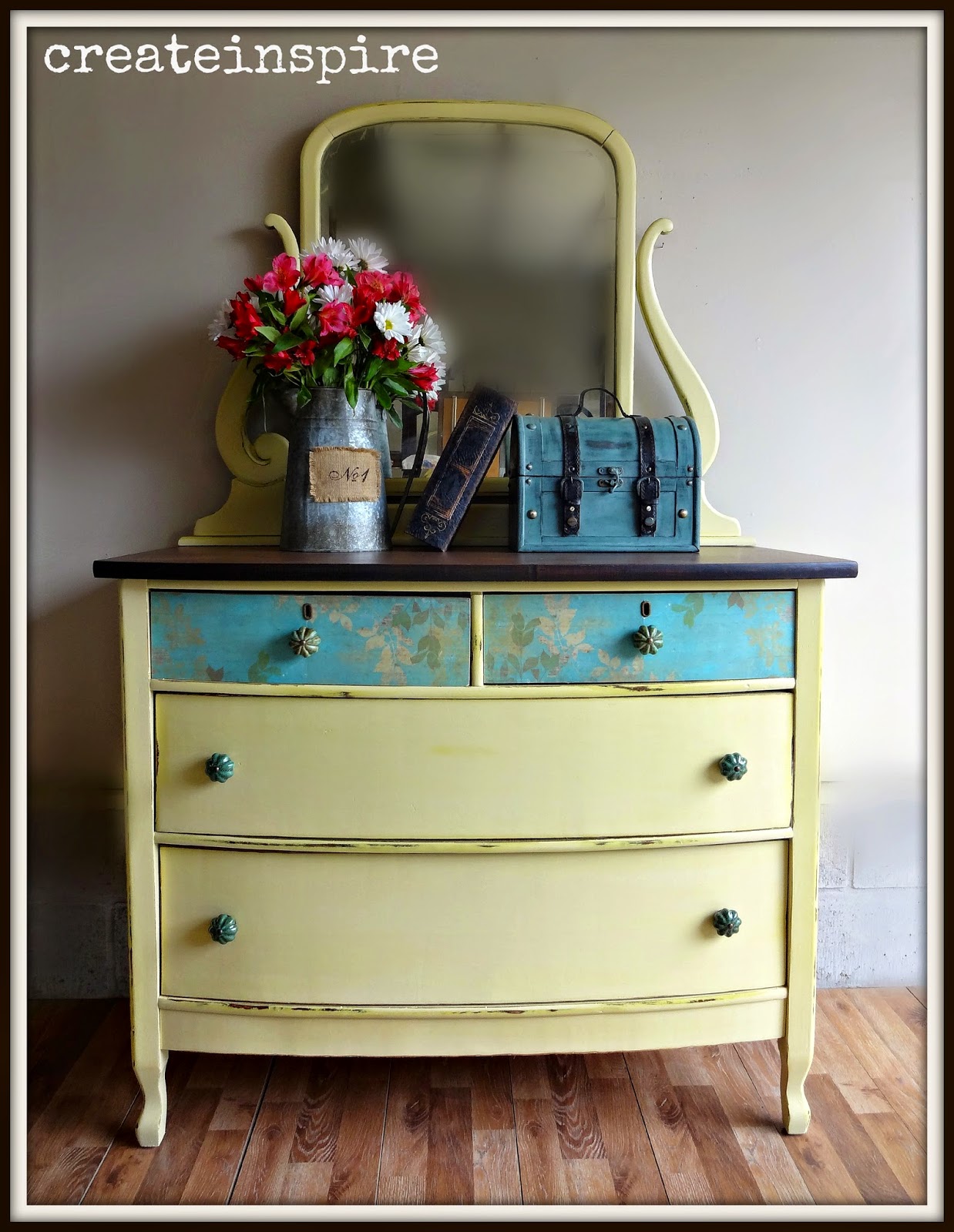
I decided on a light creamy yellow, but a little on the brighter side.  I absolutely adore it paired with the scrapbook paper I used on the drawers and contrasted against the rich wood top.  I think it's a winning combo! 

I've been doing so many customs lately that it was nice to exercise my creativity a little.  


 BEFORE

It was so dark and dreary....


 AFTER

I really love turquoise and yellow together.  Such a happy combo!


 The color is Aubusson from Fusion Mineral Paint.  I'm fairly new to Fusion, but have loved trying their products.  I highly recommend going to their website and reading about their amazing paint.  I love there logo"Foundation to Finish All in One".  It really is a great product.  I love that it is an acrylic, but has properties of a chalk paint as well.  It has a great consistency, good coverage, and they have some amazing colors!  For this dresser I layered it over a custom yellow just to give a little dimension around the edges when I distressed. 


I used Modge Podge to adhere the paper to the top two drawers.  The pattern is subtle and just gives a little visual interest. 


 I sanded down the top and it was looking rough, but 2 coats of Java Gel from General Finishes fixed her right up.  I sealed it with 3 coats of General Finishes top coat in Flat.