Monday, January 26, 2015

The Ugly Ugly Ugly Duckling


Over the past 3 years I've learned to overlook the ugly and the REALLY ugly.  It's not often I run across a piece of furniture that makes me want to gag. 

 I like details, curves, sexy legs,...you know the drill.  Sometimes I like clean lines, but most of the time I just really don't.  Mid-century isn't really my style (although Reeves from The Weathered Door does an absolutely incredible job with it and she almost has me converted).  So, when I run across these kinds of pieces every once in a while I hem and haw about buying them.  The price was right on this one and I already had someone looking for a dresser so I bit the bullet and bought it. 

It looks nice in this picture.  In real life it was green.  Yep, a ghastly, anemic, putrid, pale green.  With an undercoat of pale blue, which I'm assuming was some kind of stain blocking primer because when I started sanding on it guess what it was (well, technically still is)?  It is cherry!! 

Who in the world would put that putrescent color over cherry??  And, as if the color wasn't bad enough I can barely bring myself to look at the hardware.  Almost like Medusa's head.  Yep, it's that bad.  Now, I've said this before and have had people say. "I like that hardware!"  I just say to each his own because it is certainly not my cup of tea. 

My client said she was going to use it in her nursery and wanted it to grow with her new baby through the years.  She's having a girl, so I knew I wanted to go soft.  After staring at it (after I took that hideous hardware off) for a long while I finally decided I wanted to do something special on the bottom drawers to frame it in a little.  But, I still wanted it to be subtle, too.  

I had the biggest smile when I was done.  She turned into a lovely little thing. :)


 Before

Ummm, yuck.  That all there is to say. 


 After

I didn't actually tell my client what I was doing so when I showed her the finished dresser (minus the hardware) she said she was thinking of doing the nursery in a french country theme.  Could this be any more perfect for that?

I darkened the top for contrast and chose stripes two shades darker than the cream I used on the rest of the dresser for the bottom drawers.  I like how it defines the bottom drawers but doesn't overwhelm the piece.  I then did the stencil a shade darker than the stripes and kept it inside the outer border (if that makes sense). 


Antique brass pulls finished it off and I am in love with the monochromatic look. 


 She wanted something girly with a pop of color for the hardware. I thought these knobs were perfect, not too over the top, but still fun. :)


 My new favorite thing!!


 I always sand, never strip (mainly because I detest doing it).  Which means I have to be mindful, especially on these pieces as the veneer is really thin and you can actually sand through it.  Big boo.  So go easy!   One coat of Java Gel (cherry is naturally darker) and 3 coats of Varathane. 


What do you think?

Tuesday, January 20, 2015

Vintage Server in (almost) Linen

I came across this little, vintage server by someone tagging me on my local FB classifieds page.  I just love that people are so thoughtful. Thank you! :)

The girl who had listed it did list the dimensions, but when I saw it in person it was a tad smaller than I had envisioned it.  It's such a sweet table.  I had a vision for it prior to seeing it, but upon seeing it in person that all changed. 

Because it is a smaller piece I wanted to keep it light and soft, but unique and maybe just a little bit fun. I am so drawn to soft turquoises (like Stefan to Elena, does anybody get that reference?) and I realized I've been doing it a lot lately!  Maybe I will finally have it out of my system. Ha! 


 Before

Cute, but a little ho-hum (ok, maybe a lot ho-hum!)


 After

When I finished it hubby came in the garage and I told him I wanted to keep it.  He had his back to me, but I could just hear the words he was trying so hard to contain and the look on his face.  He said, "Funny, cuz I think you should sell it." ;)


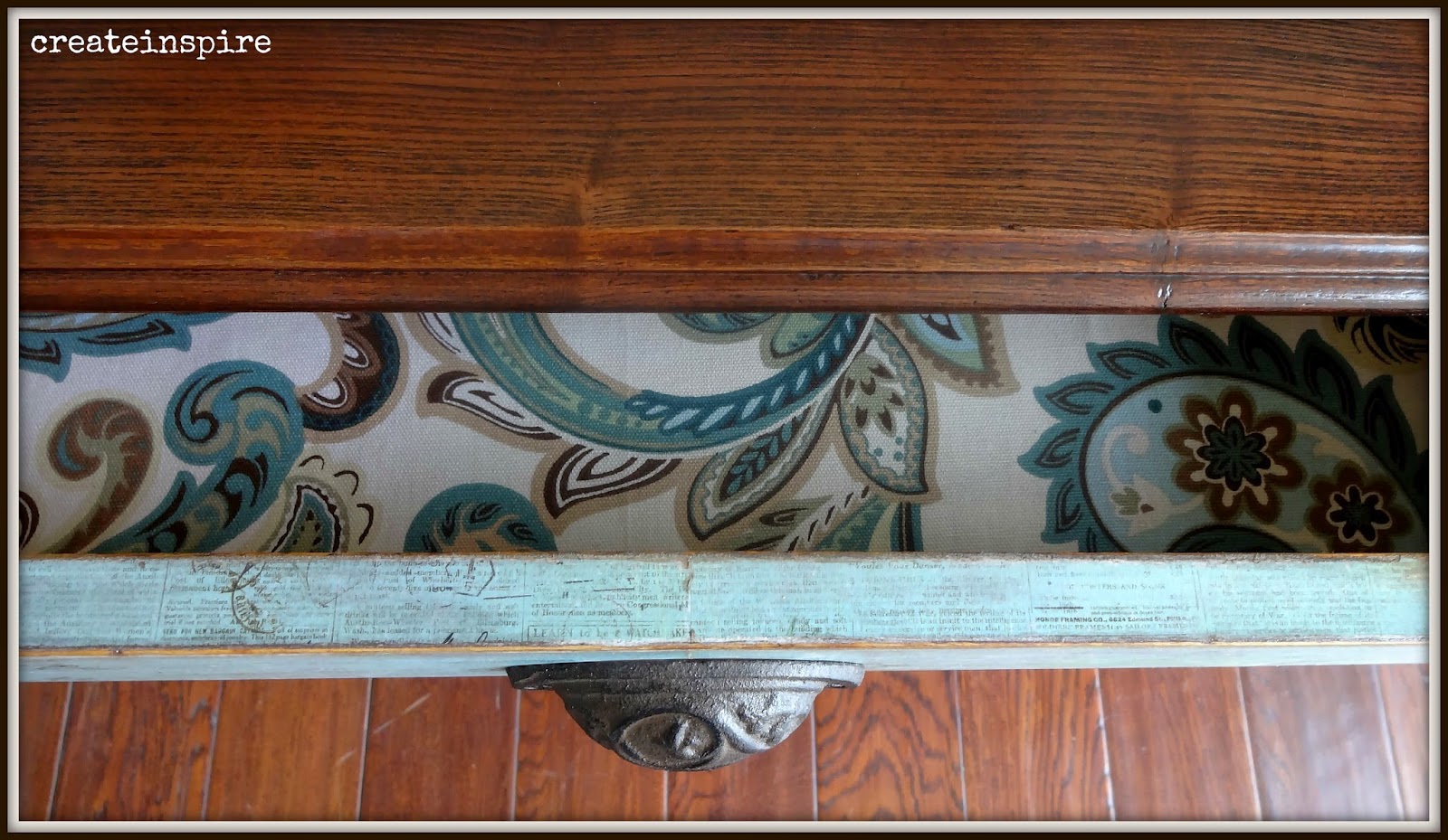
 I am still in love with Linen from General Finishes, and just lightened it a tad with some white paint I already had.  I wanted the drawer to compliment the paint, but to be different and stand out. I was a big scrapbooker before I started painting and have a ton of paper left over.  But, wouldn't you know in those drawers full of paper I couldn't find just the right one and had to make a HL trip. 
I'm glad I did!  

I also tried a couple different knobs, but liked the presence this pull had against these muted colors. 


Someone had previously refinished this piece.  When they did the stain they didn't wipe it all the way off and it hid the grain in the wood.  I sanded the top down with 150 and stained it with two coats of Java Gel (because I am completely, totally, and irrationally obsessed with it!).  I finished it off with 3 coats of Varathane in satin.


 I had this wooden applique left over from a different project and thought it would be a nice addition to the blank space on the back piece. I just did a wash of French Blue from Old Towne Paint and wiped off the excess.  Craig said, "It's subtle and ties the back in with the drawer. I like it. "
Who knew? ;)


 I also did the top edge of the drawer with the paper and I think it's my favorite part of the whole piece. It's the finishing touches I like the most!  It's so stinking cute! :)


Friday, January 16, 2015

Antique Sewing Machine Table

I saw this table on my local FB classifieds.  It was sad...sad...sad.  Nobody wanted it.  Someone went to look at it and left it behind.  I went to check it out and realized it was in pretty rough shape. 
The hinges were broken on the flip top and there was some disgusting sticker peeling off the top.  I knew I could fix her up though. :)


 Before

Some of you must have a little faith in me because I listed this on my FB just like this and it still sold. :)

My client said she was thinking of something in Robin Egg blue, which is one of my favorite colors and along the lines of what I had intended for this piece when I bought it. 
*Little side story. I bought this about a month ago and it's been sitting in my garage.  I had a few custom orders to finish up before I got to it. When I decided to refinish it I knew what I wanted to do, but second guessed myself and ended up listing it on FB.  I thought if someone bought it and told me what they wanted it would be better.  As soon as it was sold I was so sad! Lol!  My hubby thinks I'm nuts and I think he just may be right!  I wanted to do what I wanted to do.  Well, upon talking with the woman who purchased it she said I was thinking something along the lines of Robin Egg blue and you can do whatever you want with it. Really? 

So, it all worked out in then end. :)


 After

When I finished painting it and doing the paper on the drawer front I put on the knob I had originally bought for it and just wasn't happy.  It just didn't look like I had imagined it would.  So, I made an impromptu visit to HL and found the perfect fix. :)


 It is so sweet.  I did dry brush a little Chappel Green from Farrow and Ball on it to give the color a little depth, but it's very subtle.  That color will be on an upcoming project, too!


This top came a long way!!  I peeled the sticker, sanded it smooth, and then gave it a coat of Java Gel from General Finishes. 


psst...I love my little milk bottles! 


Another successful rescue! :)

Tuesday, January 13, 2015

Desk in Drizzle

I laughed when my client dropped this desk off and told me it was ok if I couldn't do anything with it because it's a piece of crap.  It's actually not!  It looks a little dated and rough, but it is solid and sturdy, so it's workable!

It's going in the same room as the dresser and nightstand I recently finished. There's not much detail to it, so I decided to do the door white to give it some definition and to help the hardware really stand out. 


Before


After

Much better! 

There was nothing special about it before, but now it's a cutie pie.  She'll fit right in with the rest of the set. 


This hardware just adds something fun to this simple desk.  Definitely the stand out feature.  They say good things come in threes and they weren't lying! "


Sometimes I think I like my staging props more than the actual furniture. ;)


Here are all the pieces together (besides the bed, it was just too awkward to take pics of).
I love how it turned out and so does she so we're good to go! 


Monday, January 12, 2015

Vintage Storage Chest in Linen

Someone tagged me on FB for this little cutie.  I instantly loved the clean lines and simple shape.  And, it's on casters!  What could be better than that?! 

The woman I purchased it from actually delivered it right to my front door.  I was so grateful I didn't have to go out in the horrendously cold weather we've been having.  I know, I'm a baby!


Before

The finish was rough but the chest, itself, was in nice shape.  A pretty easy re-do. 

My client wanted something neutral so I went to my new favorite color for a little help. It's Linen from General Finishes.  I get a little tired of white and cream.  This color has the benefit of going with everything and has a  little more depth than your traditional whites.


 After

So pretty,  I will not keep it...I will not keep it...


 I absolutely love this color with a dark wood top, too.  They compliment each other so well!


This top was sanded down and received 2 coats of Java Gel from General Finishes and 3 coats of Varathane in Satin. 


 Is there anything prettier than a delicate bunch of baby's breath in a rusty old oil can?
I think not! 


Dresser Redo in Drizzle

I refinished this cute little night stand for a client last week.  She said she used it during her childhood and her mother let her paint it when she was in HS.  I'm sorry I already deleted it (you can find the before pic on my FB page though).  She wants to use it as part of a set for her daughter's room.  It's so stinking adorable.  I was excited to move on to the rest of the "set".  When I say "set" it's not a true set.  None of the pieces actually go together, but we can make them feel like they do! 

That's one of my favorite things about paint, being able to bring pieces together to feel cohesive in a room.  


After


 Before

This is the dresser my client found at a garage sale, I believe.  (My memory is definitely not what it used to be.)  I also think she said it was free!  What?!  Can't beat that, especially when you see the after! It's made of MDF but is still in excellent condition, very sturdy (nicely made MDF furniture usually is).


 After

A fresh, new color and new hardware bring it up to date.  So perfect! 


 You already know how I feel about cup pulls, and this is exactly why!  They are an instant fast forward button for a piece of dated furniture.  These were originally antique brass so I primed them and gave them a coat of Oil Rubbed Bronze. 


The question I am most frequently asked is what kind of paint I use.  I've dabbled in it all, but my go-to paint is Pro Classic from Sherwin Williams.  It levels nicely and has good adhesion, and is easily available to me! :)  It gives such a beautiful finish. 


 <3


 The top of this dresser was also MDF and was worn through in a couple of spots.  I just gave it a nice sanding with 150, primed, and painted.  You'd never know. 


Love the simple detailing and just distressed a little heavier along it to help it pop. 


Here she is with the night stand.  The bed and desk are coming up.